
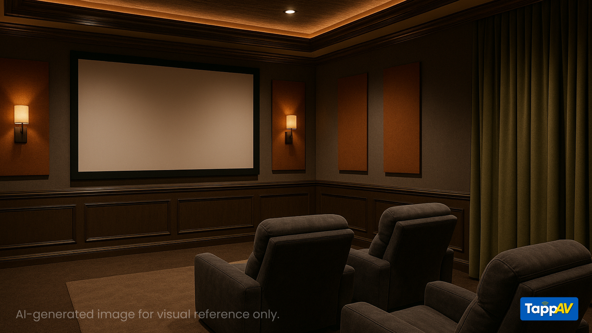
Designing a home theater isn’t just about screens and speakers, it’s about creating a complete sensory experience. One of the most overlooked (yet most impactful) design elements is color. The wrong wall shade, or fabric color or a reflective off-white ceiling can spoil your viewing quality.
In this guide, you’ll discover:
- Why color matters for performance and mood
- The most important Do’s and Don’ts
- Three professional color palettes to inspire you
- Expert tips to achieve both aesthetics and performance
Why Color Matters in Home Theater Design
In a home theater, light is both friend and foe. Your projector or TV emits light, which then bounces off every surface → walls, floors, ceilings, even your furniture.
- Bright or glossy finishes reflect this light, creating distractions, reducing image contrast, and washing out dark scenes.
- Dark, matte surfaces absorb light, focusing your attention on the screen and enhancing immersion.

The right colors help with:
- Better contrast and black levels
- Reduced light reflections
- Improved sound absorption (with fabric and carpet)
- A more cinematic, focused experience
Home Theater Color Do’s and Don’ts
DO’s
- Use dark, matte colors for walls, ceiling, and floors
- Choose neutral or deep warm tones that don’t distract
- Stick to 2–3 main shades to avoid visual clutter
- Use blackout curtains in dark shades
- Go for dark wall-to-wall carpet or rugs with thick underlays
- Introduce accent colors through fabrics and panels (not painted walls)
- Use bias or ambient lighting in warm tones for visual mood and reduced eye strain
DON’Ts
- Avoid white, off-white, cream, or pastel tones
- Don’t use semi-gloss or glossy finishes – they reflect screen light
- Skip glossy tile or laminate on floors
- Don’t overcomplicate the palette, more colors = more distractions
- Avoid cool white LEDs; they feel sterile and ruin ambiance
Home Theater Color Do’s and Don’ts
Each of these palettes is designed for specific moods and use-cases, all optimized for performance and style.
Palette 1: Classic Cinema Look
For dedicated, enclosed home theaters
|
Area |
Color Recommendation |
|
Walls |
Matte Charcoal Gray (RAL 7016) |
|
Ceiling |
Deep Black (Asian Paints “Onyx Black”) |
|
Floor |
Charcoal or Espresso Carpet |
|
Accents |
Dark Red or Maroon (velvet or suede fabric) |

This timeless combination maximizes darkness, minimizes reflection, and gives you the authentic “cinema hall” vibe.
Palette 2: Moody Modern
Great for media rooms or stylish multi-purpose spaces
|
Area |
Color Recommendation |
|
Walls |
Midnight Blue (e.g. “Starless Night”) |
|
Ceiling |
Smoky Gray (Asian Paints “Steel Symphony 5”) |
|
Seating |
Burgundy or Olive Green (matte upholstery) |
|
Acoustic Panels |
Rust Orange or Forest Green (fabric-wrapped) |

Rich, moody colors with warm undertones perfect for adding character without compromising performance.
Palette 3: Earthy Immersion
For cozy, sophisticated home theaters with natural accents
|
Area |
Color Recommendation |
|
Walls |
Warm Taupe or Chocolate Brown (matte finish) |
|
Ceiling |
Deep Olive or Matte Black |
|
Floor |
Walnut-toned carpet or dark hardwood + rug |
|
Accents |
Burnt Sienna, Clay Red, or Mustard Yellow |

Ideal if you want a warm, luxurious feel this palette balances light control with earthy, modern elegance.
Bonus Tips: Lighting, Emotion & Harmony
Use Lighting as a Design Element
- Add bias lighting behind the screen to reduce eye fatigue
- Install warm cove LEDs (amber, red, or purple) around risers or ceilings
- Experiment with star ceilings or dimmable spots to create drama
Color Psychology in Theater Spaces
|
Color |
Emotion/Effect |
Best Use |
|
Black |
Focus, elegance, drama |
Walls, ceiling |
|
Navy Blue |
Calm, immersive, rich |
Walls, accents |
|
Dark Red |
Passion, energy, luxury |
Curtains, seating |
|
Olive Green |
Organic, calm, stylish |
Seating, panels |
|
Gray |
Neutral, minimal, sleek |
Safe all-around choice |
|
White |
Distracting, reflective |
Avoid in all forms |
Tools & Services from TappAV
Want help visualizing or executing your home theater colors?
Try Our 3D Design Service
See your room layout and color choices come to life before you start.
Book Call with TappAV Expert
Get tailored color and acoustic recommendations for your space.
In a home theater, the goal of color is not to stand out but to step back. Your shades should fade into the background so the screen becomes the sole focus.
Go bold with your tech, and subtle with your design.
Design with intention. Watch with passion.


Share:
Hisense PX3 Pro Review: Is This the New King of UST Projectors?
Ultimate AVR Setup Guide for Perfect Home Theater Audio & Video